Qualitative Data
 A data sample is called qualitative, also known as categorical, if its values belong to a collection of known defined non-overlapping classes. Common examples include student letter grade (A, B, C, D or F), commercial bond rating (AAA, AAB, ...) and consumer clothing shoe sizes (1, 2, 3, ...).
The tutorials in this section are based on an R built-in data frame named painters. It is a compilation of technical information of a few eighteenth century classical painters. The data set belongs to the MASS package, and has to be pre-loaded into the R workspace prior to its use.
> library(MASS) # load the MASS package
> painters
Composition Drawing Colour Expression School
Da Udine 10 8 16 3 A
Da Vinci 15 16 4 14 A
Del Piombo 8 13 16 7 A
Del Sarto 12 16 9 8 A
Fr. Penni 0 15 8 0 A
Guilio Romano 15 16 4 14 A
.................
The last School column contains the information of school classification of the painters. The schools are named as A, B, ..., etc, and the School variable is qualitative.
> painters$School
[1] A A A A A A A A A A B B B B B B C C C C C C D D D D
[27] D D D D D D E E E E E E E F F F F G G G G G G G H H
[53] H H
Levels: A B C D E F G H
Qualitative Data
 A data sample is called qualitative, also known as categorical, if its values belong to a collection of known defined non-overlapping classes. Common examples include student letter grade (A, B, C, D or F), commercial bond rating (AAA, AAB, ...) and consumer clothing shoe sizes (1, 2, 3, ...).
The tutorials in this section are based on an R built-in data frame named painters. It is a compilation of technical information of a few eighteenth century classical painters. The data set belongs to the MASS package, and has to be pre-loaded into the R workspace prior to its use.
> library(MASS) # load the MASS package
> painters
Composition Drawing Colour Expression School
Da Udine 10 8 16 3 A
Da Vinci 15 16 4 14 A
Del Piombo 8 13 16 7 A
Del Sarto 12 16 9 8 A
Fr. Penni 0 15 8 0 A
Guilio Romano 15 16 4 14 A
.................
The last School column contains the information of school classification of the painters. The schools are named as A, B, ..., etc, and the School variable is qualitative.
> painters$School
[1] A A A A A A A A A A B B B B B B C C C C C C D D D D
[27] D D D D D D E E E E E E E F F F F G G G G G G G H H
[53] H H
Levels: A B C D E F G H
For further details of the painters data set, please consult the R documentation.
Frequency Distribution of Qualitative Data
The frequency distribution of a data variable is a summary of the data occurrence in a collection of non-overlapping categories.
Example
In the data set painters, the frequency distribution of the School variable is a summary of the number of painters in each school.
Problem
Find the frequency distribution of the painter schools in the data set painters.
Solution
We apply the table function to compute the frequency distribution of the School variable.
> library(MASS) # load the MASS package
> school = painters$School # the painter schools
> school.freq = table(school) # apply the table function
Answer
The frequency distribution of the schools is:
> school.freq
school
A B C D E F G H
10 6 6 10 7 4 7 4
Enhanced Solution
We apply the cbind function to print the result in column format.
> cbind(school.freq)
school.freq
A 10
B 6
C 6
D 10
E 7
F 4
G 7
H 4
Relative Frequency Distribution of Qualitative Data
The relative frequency distribution of a data variable is a summary of the frequency proportion in a collection of non-overlapping categories.
The relationship of frequency and relative frequency is:

Example
In the data set painters, the relative frequency distribution of the School variable is a summary of the proportion of painters in each school.
Problem
Find the relative frequency distribution of the painter schools in the data set painters.
Solution
We first apply the table function to compute the frequency distribution of the School variable.
> library(MASS) # load the MASS package
> school = painters$School # the painter schools
> school.freq = table(school) # apply the table function
Then we find the sample size of painters with the nrow function, and divide the frequency distribution with it. Therefore the relative frequency distribution is:
> school.relfreq = school.freq / nrow(painters)
Answer
The relative frequency distribution of the schools is:
> school.relfreq
school
A B C D E F
0.185185 0.111111 0.111111 0.185185 0.129630 0.074074
G H
0.129630 0.074074
Enhanced Solution
We can print with fewer digits and make it more readable by setting the digits option.
> old = options(digits=1)
> school.relfreq
school
A B C D E F G H
0.19 0.11 0.11 0.19 0.13 0.07 0.13 0.07
> options(old)
In addition, we can apply the cbind function to print the result in column format.
> old = options(digits=1)
> cbind(school.relfreq)
school.relfreq
A 0.19
B 0.11
C 0.11
D 0.19
E 0.13
F 0.07
G 0.13
H 0.07
> options(old) # restore the old option
Quantitative Data
 Quantitative data, also known as continuous data, consists of numeric data that support arithmetic operations. This is in contrast with qualitative data, whose values belong to pre-defined classes with no arithmetic operation allowed. We will explain how to apply some of the R tools for quantitative data analysis with examples.
The tutorials in this section are based on a built-in data frame named faithful. It consists of a collection of observations of the Old Faithful geyser in the USA Yellowstone National Park. The following is a preview via the head function.
> head(faithful)
eruptions waiting
1 3.600 79
2 1.800 54
3 3.333 74
4 2.283 62
5 4.533 85
6 2.883 55
There are two observation variables in the data set. The first one, called eruptions, is the duration of the geyser eruptions. The second one, called waiting, is the length of waiting period until the next eruption.
Frequency Distribution of Quantitative Data
The frequency distribution of a data variable is a summary of the data occurrence in a collection of non-overlapping categories.
Example
In the data set faithful, the frequency distribution of the eruptions variable is the summary of eruptions according to some classification of the eruption durations.
Problem
Find the frequency distribution of the eruption durations in faithful.
Solution
The solution consists of the following steps:
- We first find the range of eruption durations with the range function. It shows that the observed eruptions are between 1.6 and 5.1 minutes in duration.
> duration = faithful$eruptions
> range(duration)
[1] 1.6 5.1
- Break the range into non-overlapping sub-intervals by defining a sequence of equal distance break points. If we round the endpoints of the interval [1.6, 5.1] to the closest half-integers, we come up with the interval [1.5, 5.5]. Hence we set the break points to be the half-integer sequence { 1.5, 2.0, 2.5, ... }.
> breaks = seq(1.5, 5.5, by=0.5) # half
-integer sequence
> breaks
[1] 1.5 2.0 2.5 3.0 3.5 4.0 4.5 5.0 5.5
- Classify the eruption durations according to the half-unit-length sub-intervals with cut. As the intervals are to be closed on the left, and open on the right, we set the right argument as FALSE.
> duration.cut = cut(duration, breaks, right=FALSE)
- Compute the frequency of eruptions in each sub-interval with the table function.
> duration.freq = table(duration.cut)
Answer
The frequency distribution of the eruption duration is:
> duration.freq
duration.cut
[1.5,2) [2,2.5) [2.5,3) [3,3.5) [3.5,4) [4,4.5) [4.5,5)
51 41 5 7 30 73 61
[5,5.5)
4
Enhanced Solution
We apply the cbind function to print the result in column format.
> cbind(duration.freq)
duration.freq
[1.5,2) 51
[2,2.5) 41
[2.5,3) 5
[3,3.5) 7
[3.5,4) 30
[4,4.5) 73
[4.5,5) 61
[5,5.5) 4
Relative Frequency Distribution of Quantitative Data
The relative frequency distribution of a data variable is a summary of the frequency proportion in a collection of non-overlapping categories.
The relationship of frequency and relative frequency is:

Example
In the data set faithful, the relative frequency distribution of the eruptions variable shows the frequency proportion of the eruptions according to a duration classification.
Problem
Find the relative frequency distribution of the eruption durations in faithful.
Solution
We first find the frequency distribution of the eruption durations as follows. Further details can be found in the Frequency Distribution tutorial.
> duration = faithful$eruptions
> breaks = seq(1.5, 5.5, by=0.5)
> duration.cut = cut(duration, breaks, right=FALSE)
> duration.freq = table(duration.cut)
Then we find the sample size of faithful with the nrow function, and divide the frequency distribution with it. As a result, the relative frequency distribution is:
> duration.relfreq = duration.freq / nrow(faithful)
Answer
The frequency distribution of the eruption variable is:
> duration.relfreq
duration.cut
[1.5,2) [2,2.5) [2.5,3) [3,3.5) [3.5,4) [4,4.5)
0.187500 0.150735 0.018382 0.025735 0.110294 0.268382
[4.5,5) [5,5.5)
0.224265 0.014706
Enhanced Solution
We can print with fewer digits and make it more readable by setting the digits option.
> old = options(digits=1)
> duration.relfreq
duration.cut
[1.5,2) [2,2.5) [2.5,3) [3,3.5) [3.5,4) [4,4.5) [4.5,5)
0.19 0.15 0.02 0.03 0.11 0.27 0.22
[5,5.5)
0.01
> options(old) # restore the old option
We then apply the cbind function to print both the frequency distribution and relative frequency distribution in parallel columns.
> old = options(digits=1)
> cbind(duration.freq, duration.relfreq)
duration.freq duration.relfreq
[1.5,2) 51 0.19
[2,2.5) 41 0.15
[2.5,3) 5 0.02
[3,3.5) 7 0.03
[3.5,4) 30 0.11
[4,4.5) 73 0.27
[4.5,5) 61 0.22
[5,5.5) 4 0.01
> options(old) # restore the old option
Cumulative Frequency Distribution
The cumulative frequency distribution of a quantitative variable is a summary of data frequency below a given level.
Example
In the data set faithful, the cumulative frequency distribution of the eruptions variable shows the total number of eruptions whose durations are less than or equal to a set of chosen levels.
Problem
Find the cumulative frequency distribution of the eruption durations in faithful.
Solution
We first find the frequency distribution of the eruption durations as follows. Further details can be found in the Frequency Distribution tutorial.
> duration = faithful$eruptions
> breaks = seq(1.5, 5.5, by=0.5)
> duration.cut = cut(duration, breaks, right=FALSE)
> duration.freq = table(duration.cut)
We then apply the cumsum function to compute the cumulative frequency distribution.
> duration.cumfreq = cumsum(duration.freq)
Answer
The cumulative distribution of the eruption duration is:
> duration.cumfreq
[1.5,2) [2,2.5) [2.5,3) [3,3.5) [3.5,4) [4,4.5) [4.5,5)
51 92 97 104 134 207 268
[5,5.5)
272
Enhanced Solution
We apply the cbind function to print the result in column format.
> cbind(duration.cumfreq)
duration.cumfreq
[1.5,2) 51
[2,2.5) 92
[2.5,3) 97
[3,3.5) 104
[3.5,4) 134
[4,4.5) 207
[4.5,5) 268
[5,5.5) 272
umulative Frequency Graph
A cumulative frequency graph or ogive of a quantitative variable is a curve graphically showing the cumulative frequency distribution.
Example
In the data set faithful, a point in the cumulative frequency graph of the eruptions variable shows the total number of eruptions whose durations are less than or equal to a given level.
Problem
Find the cumulative frequency graph of the eruption durations in faithful.
Solution
We first find the frequency distribution of the eruption durations as follows. Check the previous tutorial on Frequency Distribution for details.
> duration = faithful$eruptions
> breaks = seq(1.5, 5.5, by=0.5)
> duration.cut = cut(duration, breaks, right=FALSE)
> duration.freq = table(duration.cut)
We then compute its cumulative frequency with cumsum, add a starting zero element, and plot the graph.
> cumfreq0 = c(0, cumsum(duration.freq))
> plot(breaks, cumfreq0, # plot the data
+ main="Old Faithful Eruptions", # main title
+ xlab="Duration minutes", # x
−axis label
+ ylab="Cumulative eruptions") # y
−axis label
> lines(breaks, cumfreq0) # join the points
Cumulative Relative Frequency Distribution
The cumulative relative frequency distribution of a quantitative variable is a summary of frequency proportion below a given level.
The relationship between cumulative frequency and relative cumulative frequency is:

Example
In the data set faithful, the cumulative relative frequency distribution of the eruptions variable shows the frequency proportion of eruptions whose durations are less than or equal to a set of chosen levels.
Problem
Find the cumulative relative frequency distribution of the eruption durations in faithful.
Solution
We first find the frequency distribution of the eruption durations as follows. Further details can be found in the Frequency Distribution tutorial.
> duration = faithful$eruptions
> breaks = seq(1.5, 5.5, by=0.5)
> duration.cut = cut(duration, breaks, right=FALSE)
> duration.freq = table(duration.cut)
We then apply the cumsum function to compute the cumulative frequency distribution.
> duration.cumfreq = cumsum(duration.freq)
Then we find the sample size of faithful with the nrow function, and divide the cumulative frequency distribution with it. As a result, the cumulative relative frequency distribution is:
> duration.cumrelfreq = duration.cumfreq / nrow(faithful)
Answer
The cumulative relative frequency distribution of the eruption variable is:
> duration.cumrelfreq
[1.5,2) [2,2.5) [2.5,3) [3,3.5) [3.5,4) [4,4.5) [4.5,5)
0.18750 0.33824 0.35662 0.38235 0.49265 0.76103 0.98529
[5,5.5)
1.00000
Enhanced Solution
We can print with fewer digits and make it more readable by setting the digits option.
> old = options(digits=2)
> duration.cumrelfreq
[1.5,2) [2,2.5) [2.5,3) [3,3.5) [3.5,4) [4,4.5) [4.5,5)
0.19 0.34 0.36 0.38 0.49 0.76 0.99
[5,5.5)
1.00
> options(old) # restore the old option
We then apply the cbind function to print both the cumulative frequency distribution and relative cumulative frequency distribution in parallel columns.
> old = options(digits=2)
> cbind(duration.cumfreq, duration.cumrelfreq)
duration.cumfreq duration.cumrelfreq
[1.5,2) 51 0.19
[2,2.5) 92 0.34
[2.5,3) 97 0.36
[3,3.5) 104 0.38
[3.5,4) 134 0.49
[4,4.5) 207 0.76
[4.5,5) 268 0.99
[5,5.5) 272 1.00
> options(old)
R - Line Graphs
A line chart is a graph that connects a series of points by drawing line segments between them. These points are ordered in one of their coordinate (usually the x-coordinate) value. Line charts are usually used in identifying the trends in data.
The plot() function in R is used to create the line graph.
Syntax
The basic syntax to create a line chart in R is −
plot(v,type,col,xlab,ylab)
Following is the description of the parameters used −
v is a vector containing the numeric values.
type takes the value "p" to draw only the points, "l" to draw only the lines and "o" to draw both points and lines.
xlab is the label for x axis.
ylab is the label for y axis.
main is the Title of the chart.
col is used to give colors to both the points and lines.
Example
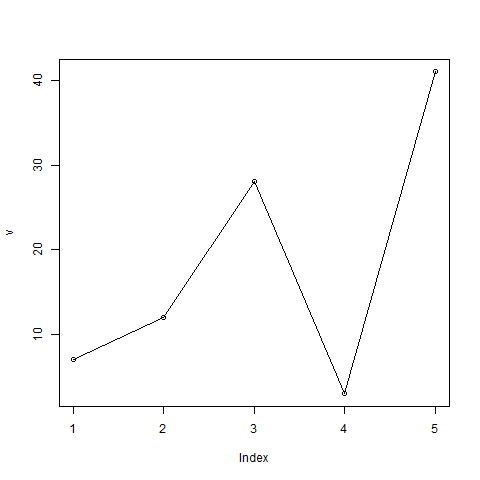
A simple line chart is created using the input vector and the type parameter as "O". The below script will create and save a line chart in the current R working directory.
# Create the data for the chart.
v <- c(7,12,28,3,41)

# Give the chart file a name.
png(file = "line_chart.jpg")

# Plot the bar chart.
plot(v,type = "o")

# Save the file.
dev.off()
When we execute the above code, it produces the following result −

Line Chart Title, Color and Labels
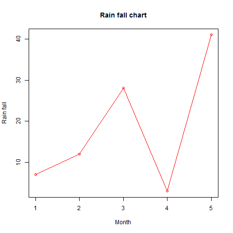
The features of the line chart can be expanded by using additional parameters. We add color to the points and lines, give a title to the chart and add labels to the axes.
Example
# Create the data for the chart.
v <- c(7,12,28,3,41)

# Give the chart file a name.
png(file = "line_chart_label_colored.jpg")

# Plot the bar chart.
plot(v,type = "o", col = "red", xlab = "Month", ylab = "Rain fall",
   main = "Rain fall chart")

# Save the file.
dev.off()
When we execute the above code, it produces the following result −

Multiple Lines in a Line Chart
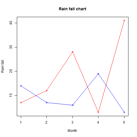
More than one line can be drawn on the same chart by using the lines()function.
After the first line is plotted, the lines() function can use an additional vector as input to draw the second line in the chart,
# Create the data for the chart.
v <- c(7,12,28,3,41)
t <- c(14,7,6,19,3)

# Give the chart file a name.
png(file = "line_chart_2_lines.jpg")

# Plot the bar chart.
plot(v,type = "o",col = "red", xlab = "Month", ylab = "Rain fall",
   main = "Rain fall chart")

lines(t, type = "o", col = "blue")

# Save the file.
dev.off()
When we execute the above code, it produces the following result −

R - Bar Charts
A bar chart represents data in rectangular bars with length of the bar proportional to the value of the variable. R uses the function barplot() to create bar charts. R can draw both vertical and Horizontal bars in the bar chart. In bar chart each of the bars can be given different colors.
Syntax
The basic syntax to create a bar-chart in R is −
barplot(H,xlab,ylab,main, names.arg,col)
Following is the description of the parameters used −
- H is a vector or matrix containing numeric values used in bar chart.
- xlab is the label for x axis.
- ylab is the label for y axis.
- main is the title of the bar chart.
- names.arg is a vector of names appearing under each bar.
- col is used to give colors to the bars in the graph.
Example
A simple bar chart is created using just the input vector and the name of each bar.
The below script will create and save the bar chart in the current R working directory.
# Create the data for the chart
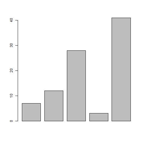
H <- c(7,12,28,3,41)

# Give the chart file a name
png(file = "barchart.png")

# Plot the bar chart
barplot(H)

# Save the file
dev.off()
When we execute above code, it produces following result −

Bar Chart Labels, Title and Colors
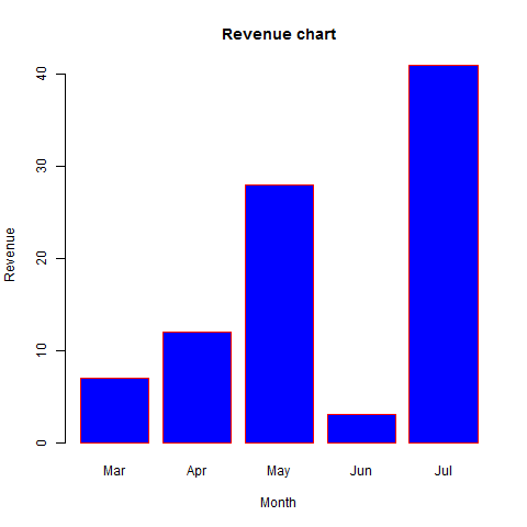
The features of the bar chart can be expanded by adding more parameters. The main parameter is used to add title. The col parameter is used to add colors to the bars. The args.name is a vector having same number of values as the input vector to describe the meaning of each bar.
Example
The below script will create and save the bar chart in the current R working directory.
# Create the data for the chart
H <- c(7,12,28,3,41)
M <- c("Mar","Apr","May","Jun","Jul")

# Give the chart file a name
png(file = "barchart_months_revenue.png")

# Plot the bar chart
barplot(H,names.arg=M,xlab="Month",ylab="Revenue",col="blue",
main="Revenue chart",border="red")

# Save the file
dev.off()
When we execute above code, it produces following result −

Group Bar Chart and Stacked Bar Chart
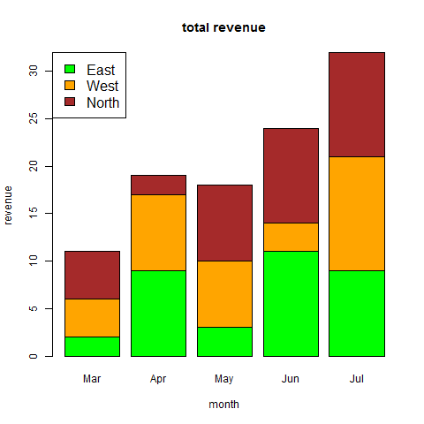
We can create bar chart with groups of bars and stacks in each bar by using a matrix as input values.
More than two variables are represented as a matrix which is used to create the group bar chart and stacked bar chart.
# Create the input vectors.
colors = c("green","orange","brown")
months <- c("Mar","Apr","May","Jun","Jul")
regions <- c("East","West","North")

# Create the matrix of the values.
Values <- matrix(c(2,9,3,11,9,4,8,7,3,12,5,2,8,10,11), nrow = 3, ncol = 5, byrow = TRUE)

# Give the chart file a name
png(file = "barchart_stacked.png")

# Create the bar chart
barplot(Values, main = "total revenue", names.arg = months, xlab = "month", ylab = "revenue", col = colors)

# Add the legend to the chart
legend("topleft", regions, cex = 1.3, fill = colors)

# Save the file
dev.off()
R - Pie Charts
R Programming language has numerous libraries to create charts and graphs. A pie-chart is a representation of values as slices of a circle with different colors. The slices are labeled and the numbers corresponding to each slice is also represented in the chart.
In R the pie chart is created using the pie() function which takes positive numbers as a vector input. The additional parameters are used to control labels, color, title etc.
Syntax
The basic syntax for creating a pie-chart using the R is −
pie(x, labels, radius, main, col, clockwise)
Following is the description of the parameters used −
x is a vector containing the numeric values used in the pie chart.
labels is used to give description to the slices.
radius indicates the radius of the circle of the pie chart.(value between −1 and +1).
main indicates the title of the chart.
col indicates the color palette.
clockwise is a logical value indicating if the slices are drawn clockwise or anti clockwise.
Example
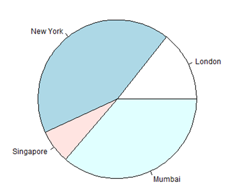
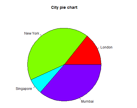
A very simple pie-chart is created using just the input vector and labels. The below script will create and save the pie chart in the current R working directory.
# Create data for the graph.
x <- c(21, 62, 10, 53)
labels <- c("London", "New York", "Singapore", "Mumbai")

# Give the chart file a name.
png(file = "city.png")

# Plot the chart.
pie(x,labels)

# Save the file.
dev.off()
When we execute the above code, it produces the following result −
Pie Chart Title and Colors
We can expand the features of the chart by adding more parameters to the function. We will use parameter main to add a title to the chart and another parameter is col which will make use of rainbow colour pallet while drawing the chart. The length of the pallet should be same as the number of values we have for the chart. Hence we use length(x).
Example
The below script will create and save the pie chart in the current R working directory.
# Create data for the graph.
x <- c(21, 62, 10, 53)
labels <- c("London", "New York", "Singapore", "Mumbai")

# Give the chart file a name.
png(file = "city_title_colours.jpg")

# Plot the chart with title and rainbow color pallet.
pie(x, labels, main = "City pie chart", col = rainbow(length(x)))

# Save the file.
dev.off()
When we execute the above code, it produces the following result −

Slice Percentages and Chart Legend
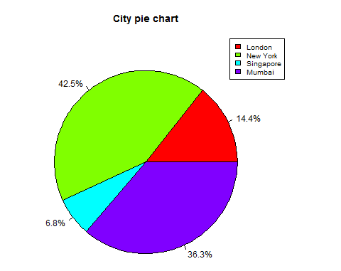
We can add slice percentage and a chart legend by creating additional chart variables.
# Create data for the graph.
x <-  c(21, 62, 10,53)
labels <-  c("London","New York","Singapore","Mumbai")

piepercent<- round(100*x/sum(x), 1)

# Give the chart file a name.
png(file = "city_percentage_legends.jpg")

# Plot the chart.
pie(x, labels = piepercent, main = "City pie chart",col = rainbow(length(x)))
legend("topright", c("London","New York","Singapore","Mumbai"), cex = 0.8,
   fill = rainbow(length(x)))

# Save the file.
dev.off()
When we execute the above code, it produces the following result −

3D Pie Chart
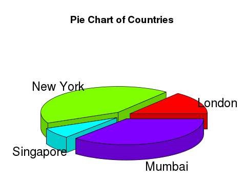
A pie chart with 3 dimensions can be drawn using additional packages. The package plotrix has a function called pie3D() that is used for this.
# Get the library.
library(plotrix)

# Create data for the graph.
x <-  c(21, 62, 10,53)
lbl <-  c("London","New York","Singapore","Mumbai")

# Give the chart file a name.
png(file = "3d_pie_chart.jpg")

# Plot the chart.
pie3D(x,labels = lbl,explode = 0.1, main = "Pie Chart of Countries ")

# Save the file.
dev.off()
When we execute the above code, it produces the following result −

R - Boxplots
Boxplots are a measure of how well distributed is the data in a data set. It divides the data set into three quartiles. This graph represents the minimum, maximum, median, first quartile and third quartile in the data set. It is also useful in comparing the distribution of data across data sets by drawing boxplots for each of them.
Boxplots are created in R by using the boxplot() function.
Syntax
The basic syntax to create a boxplot in R is −
boxplot(x, data, notch, varwidth, names, main)
Following is the description of the parameters used −
x is a vector or a formula.
data is the data frame.
notch is a logical value. Set as TRUE to draw a notch.
varwidth is a logical value. Set as true to draw width of the box proportionate to the sample size.
names are the group labels which will be printed under each boxplot.
main is used to give a title to the graph.
Example
We use the data set "mtcars" available in the R environment to create a basic boxplot. Let's look at the columns "mpg" and "cyl" in mtcars.
input <- mtcars[,c('mpg','cyl')]
print(head(input))
When we execute above code, it produces following result −
                   mpg  cyl
Mazda RX4         21.0   6
Mazda RX4 Wag     21.0   6
Datsun 710        22.8   4
Hornet 4 Drive    21.4   6
Hornet Sportabout 18.7   8
Valiant           18.1   6
Creating the Boxplot
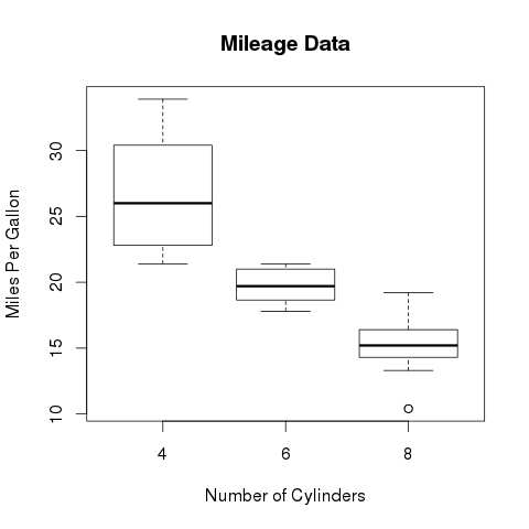
The below script will create a boxplot graph for the relation between mpg (miles per gallon) and cyl (number of cylinders).
# Give the chart file a name.
png(file = "boxplot.png")

# Plot the chart.
boxplot(mpg ~ cyl, data = mtcars, xlab = "Number of Cylinders",
   ylab = "Miles Per Gallon", main = "Mileage Data")

# Save the file.
dev.off()
When we execute the above code, it produces the following result −

Boxplot with Notch
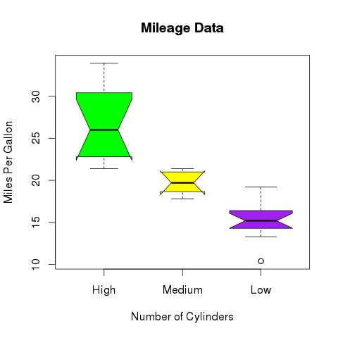
We can draw boxplot with notch to find out how the medians of different data groups match with each other.
The below script will create a boxplot graph with notch for each of the data group.
# Give the chart file a name.
png(file = "boxplot_with_notch.png")

# Plot the chart.
boxplot(mpg ~ cyl, data = mtcars,
   xlab = "Number of Cylinders",
   ylab = "Miles Per Gallon",
   main = "Mileage Data",
   notch = TRUE,
   varwidth = TRUE,
   col = c("green","yellow","purple"),
   names = c("High","Medium","Low")
)
# Save the file.
dev.off()
When we execute the above code, it produces the following result −

R - Histograms
A histogram represents the frequencies of values of a variable bucketed into ranges. Histogram is similar to bar chat but the difference is it groups the values into continuous ranges. Each bar in histogram represents the height of the number of values present in that range.
R creates histogram using hist() function. This function takes a vector as an input and uses some more parameters to plot histograms.
Syntax
The basic syntax for creating a histogram using R is −
hist(v,main,xlab,xlim,ylim,breaks,col,border)
Following is the description of the parameters used −
v is a vector containing numeric values used in histogram.
main indicates title of the chart.
col is used to set color of the bars.
border is used to set border color of each bar.
xlab is used to give description of x-axis.
xlim is used to specify the range of values on the x-axis.
ylim is used to specify the range of values on the y-axis.
breaks is used to mention the width of each bar.
Example
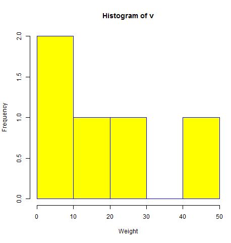
A simple histogram is created using input vector, label, col and border parameters.
The script given below will create and save the histogram in the current R working directory.
# Create data for the graph.
v <-  c(9,13,21,8,36,22,12,41,31,33,19)

# Give the chart file a name.
png(file = "histogram.png")

# Create the histogram.
hist(v,xlab = "Weight",col = "yellow",border = "blue")

# Save the file.
dev.off()
When we execute the above code, it produces the following result −

Range of X and Y values
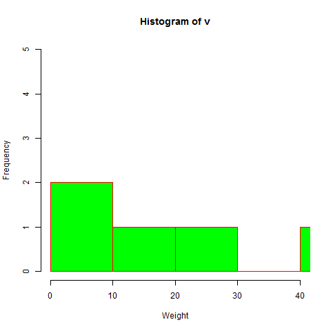
To specify the range of values allowed in X axis and Y axis, we can use the xlim and ylim parameters.
The width of each of the bar can be decided by using breaks.
# Create data for the graph.
v <- c(9,13,21,8,36,22,12,41,31,33,19)

# Give the chart file a name.
png(file = "histogram_lim_breaks.png")

# Create the histogram.
hist(v,xlab = "Weight",col = "green",border = "red", xlim = c(0,40), ylim = c(0,5),
   breaks = 5)

# Save the file.
dev.off()
When we execute the above code, it produces the following result −

R - Scatterplots
Scatterplots show many points plotted in the Cartesian plane. Each point represents the values of two variables. One variable is chosen in the horizontal axis and another in the vertical axis.
The simple scatterplot is created using the plot() function.
Syntax
The basic syntax for creating scatterplot in R is −
plot(x, y, main, xlab, ylab, xlim, ylim, axes)
Following is the description of the parameters used −
x is the data set whose values are the horizontal coordinates.
y is the data set whose values are the vertical coordinates.
main is the tile of the graph.
xlab is the label in the horizontal axis.
ylab is the label in the vertical axis.
xlim is the limits of the values of x used for plotting.
ylim is the limits of the values of y used for plotting.
axes indicates whether both axes should be drawn on the plot.
Example
We use the data set "mtcars" available in the R environment to create a basic scatterplot. Let's use the columns "wt" and "mpg" in mtcars.
input <- mtcars[,c('wt','mpg')]
print(head(input))
When we execute the above code, it produces the following result −
                    wt      mpg
Mazda RX4           2.620   21.0
Mazda RX4 Wag       2.875   21.0
Datsun 710          2.320   22.8
Hornet 4 Drive      3.215   21.4
Hornet Sportabout   3.440   18.7
Valiant             3.460   18.1
Creating the Scatterplot
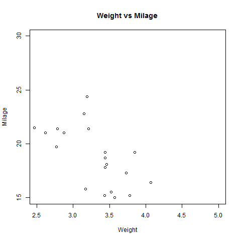
The below script will create a scatterplot graph for the relation between wt(weight) and mpg(miles per gallon).
# Get the input values.
input <- mtcars[,c('wt','mpg')]

# Give the chart file a name.
png(file = "scatterplot.png")

# Plot the chart for cars with weight between 2.5 to 5 and mileage between 15 and 30.
plot(x = input$wt,y = input$mpg,
   xlab = "Weight",
   ylab = "Milage",
   xlim = c(2.5,5),
   ylim = c(15,30),
   main = "Weight vs Milage"
)

# Save the file.
dev.off()
When we execute the above code, it produces the following result −

Scatterplot Matrices
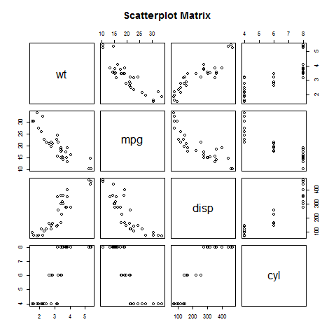
When we have more than two variables and we want to find the correlation between one variable versus the remaining ones we use scatterplot matrix. We use pairs() function to create matrices of scatterplots.
Syntax
The basic syntax for creating scatterplot matrices in R is −
pairs(formula, data)
Following is the description of the parameters used −
Example
Each variable is paired up with each of the remaining variable. A scatterplot is plotted for each pair.
# Give the chart file a name.
png(file = "scatterplot_matrices.png")

# Plot the matrices between 4 variables giving 12 plots.

# One variable with 3 others and total 4 variables.

pairs(~wt+mpg+disp+cyl,data = mtcars,
   main = "Scatterplot Matrix")

# Save the file.
dev.off()
When the above code is executed we get the following output.
